Monday 11 April 2011

Evaluation.

In this project our aim was to research and plan, using a scrapbook and Blog, firstly the front page and contents page of a new College magazine and then secondly the front page, contents page and Double-page spread of a new music magazine, and then we had to create both using our own photographs and ideas.

To begin with I had to start by researching the different components that make a magazine, and by using this I created a Mock magazine, to show evidence that I know the elements well. I then started to research the college magazines in circulation in today’s market, such as ‘Ridgewater’; I did this by reading hard copies and then looking on the Internet for the front pages.  I then went to take photographs for the college magazine using my friends and objects around the house. From that I then brainstormed my ideas in a Mind map of my ideas and from this I concluded what I was going to put into my college Magazine.
For my Music magazine, I had previously read music magazines of the genre I was basing my magazine on, so I picked my old copies of the magazines, such as Kerrang! And Rocksound and re-read the to see what the contents of the magazines are and to see the layout. As I continued to do this research and create the magazines I filled in my scrapbook with the research and work and my blog as well.

Although I was quick to create the magazines using the software, and print each stage off, I didn’t stick the hard copies of my work straight into my scrapbook furthermore I did not write about them straight away, therefore I was left lots of writing to do when I had completed the music magazine. But as I had finished my magazine quite quickly I was able to catch up with the writing to finish. However I may have finished my scrapbook on time, my Blog seemed to have suffered, I had forgotten that I had a blog to write as I am no used to writing one, therefore I was behind with my Blog, so I rushed to finish it on time.
If I had to do this project again I would have used my time better, by keeping my scrapbook and blog up to date with each stage of my magazine instead of rushing at the end.

I did not face many problems with my coursework, but the problems I did have were at first the blog confused me, but the more I went on it, the more I became confident with using this.  Another problem I faced was with the software Quark Express, I had a crash course in the software at the beginning of the year, but I had forgotten how to use several parts, but to solve this problem I just asked my classmates and the tutor for help if I became stuck.

In the course of creating my foundation portfolio, I learnt new skills such as; I developed knowledge on how to use photo-editing software, to enhance my photographs and to make cool effects, I also learned how to use Quark Express to create a magazine. Furthermore I learned how to use an Apple Mac, which I have never used before; it has a different layout from P. C and so I was unsure where different software was and how to get things to print, but like the blog, the more I used the Mac the better I became at using the computer;  but the moments I did become confused I asked my tutor for help.

I believe that blog has been set out in a way that is easy to read and has a simple layout to understand. I have provided evidence of my work on the blog in the form of pictures, to get some of the pictures I had to scan pages from my scrapbook but overall I think that is a decent blog. However I do have some criticisms of my blog the first being, that I left a large gap between posts because I forgot about my blog, also I don’t believe that I had enough posts for my work. And finally I would have like to have had more polls and people opinions on my blog so I have more of an idea on what the general public thought.

For my college                 I wrote an evaluation of it my scrapbook, but if I had more time I would have took different pictures to use on the front cover, maybe of a student outside, and not when its dark and in a house. Also I would have probably changed the colours used on the front cover, from pink and yellow, to different colours that are more male friendly, like red or green.

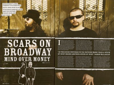
Overall I think that my music magazine is a great representation of my work over the past couple of months. With my first design of my music magazine cover I was unhappy with the layout, and design, so I decided to redo it until I happy with the results. The only thing I think I would change would be the Picture at the front, I think I needed a better quality of picture, the picture I have used looks a little blurred.

In my scrapbook I would have wished it to made a little neater, in the layout and perhaps in chronological order. I would have also liked to have more work put in to the book in terms of research and public opinion, such as surveys and questionnaires, but also I would have liked to have used a more varied use of different media, like videos.

Overall I am happy with my foundation portfolio and the work I produced within it..

Finished Article

My Finished Music Magazine project:

Double Page Final Stage and Article

Final Draft:

The article ends mid sentence on purpose, so it looks like it carries on, on the next page which is the look I wanted; and not because the words have been cut off, like some people thought.

ARTICLE:
It has been a while since we have seen the Scottish lads from Kilmarnock down in
Norwich, but the atmosphere they bring with them an indescribable atmosphere, that just engulfs the venue, passersby unaware of the magic that will be made before them. The cold night agitates the crowd, they desperately want in to the venue, and finally they are granted their wish the doors open and an
Avalanche of people surge through the door and the all familiar clash of the elbows ensue, for the holy grail of views - the front row.
The lights go down and the room hushes, it is now time for the first support band to grace the stage. ‘Pulled Apart by Horses’ is a four piece alternative rock band who, hail from the north, Leeds to be precise. They jump around the stage, interacting with the crowd at any given moment. Tom Hudson the front man leaps into the galley between audience and stage and struts with microphone in hand, high fiving the gig-goers while singing the songs, to the melody of heavy guitar riffs and pounding drum rhythms. They rile the crowd better than most support acts, which, is an achievement to be proud of. The next band to entertain the UEA crowd is The Manchester Orchestra, which as the name suggests, is not an actual orchestra but an indie-rock band from the southern American state of Georgia, Atlanta to be precise.  They let out pounding beats and melodies, and the soulful voice of Front man Andy Hull brings the music together. However, the crowd although enthusiastic, were growing impatient, waiting for the band they came to see tonight, the crowd almost seem bored, much like the look of the bassist who seems to be in his own world away from the stage and the impatient crowd.  Eventually the 20 minute set ends and The Manchester Orchestra exit the stage.  The men in black, the roadies, come to change the instruments along and create the stage, to which Biffy Clyro will perform. The odd person hurls an insult towards the roadies, who always seem to take the flak from the forever weary and impatient crowd. Then the stage goes dark. Suddenly music begins the instrumental to ‘Living is a problem because everything dies’, the crowds erupts into screams and shouts as each member of Biffy Clyro graces the stage.  And then Simon Neil opens his mouth and sings his lungs out while keeping his eyes shut like a child with stage fright. Songs old and new are performed, with a continuous surge of passion radiating from Simon Neil, as if he is singing from the depths of his soul. To accompany the brilliant music is a fantastic light set, strobe lights flash to the pounding of the drums, Lights flash blue and white to the riffs and melodies strummed out by James Johnston .The band interact with the crowd as if they are all one, the microphone into the sea of bodies, as a scramble to grab the microphone breakout as one lucky girl emerges singing her lungs out to “Saturday   Superhouse”.  Finally the band declare this is their final song which is met with cries of  distress.

Double Page Spread Stage #2


Double Page Spread Stage #1

Double Page Spread so far:


In this stage I have added in my title ‘Mon the Biff’ which is a phrase chanted by fans of the band Biffy Clyro, which the article is written about. It is I have used this colour scheme due to the fact that the band is Scottish and are proud to be, so the colour s are representatives of the Scottish flag, blue and white. Although I couldn’t make the “Mon” and “Biff” the same colour as the two words would not stand out so I had to differ the shades of blue.
The pictures on the left had page have been ordered to look like they are scattered and disorganised, it is meant to represent the chaos of a gig, and how there are, but also they are set out like someone is looking through then  and left them on the table, which is what I wanted to aim for.

Basic layout of Double Page spread.

The basic layout of my D.P.S is half way down the left page is two columns for the text. On the next page, at the top is a space for the pictures, and then there is a space underneath the picture box for a quote, which is often done by magazine, as to draw in the audience into reading the article. In the last third of the page are two columns for a little more text.


Double Page Spread Research.

Music magazine contents pages:


Double page spreads tend to vary depending on the contents of the article they are based upon,  most are set in columns and grid, they contain photograph or illustrations and depending where the double page spread is on the article it will have a title.
After reading some music magazines as well, I think I can start drafting my double page spread confidence.

My Contents Page.

For my contents page I took a majority of my work from the research I did for the contents pages. I did this because these are successful magazines, so they have a formula that works and sells magazine, so I tried to follow in their footsteps.
I have done this by using headings to organise the articles, these are News, Features, Live, and Regulars. The writing is aligned to the left hand side  , so the readers would look at that first as people usually read left to right, it seem the logical alignment. The numbers are in a blue colour, so the number would stand out and so people could tell the article and the page number apart.
The pictures are of musicians and bands, which consist of two larger picture and four smaller pictures so overall there is a balance to the contents page. I have left the contents page simple, as I don’t think the page needs to be overloaded with things, as sometimes this could lead to the page looking messy.
Although I am happy with the layout of the contents page and how it looks, I think I can add more page numbers in it and also I have forgotten to add in the free poster part of the magazine, I will do this at a later date.

I have now added in the free posters and more page numbers:

Research for contents page.

Music magazine contents page:


I have taken contents pages from leading music magazines on the current market, to see what things they included in their contents pages.
From my research I gathered that these contents page had the basic of page numbers and article titles, also they had pictures of the musicians and bands. Although they are similar they differ in small ways such as Kerrang have an editorial board, whereas the others don’t; most of the contents pages have headings to which the articles are sorted into.
The layout of the contents pages differ, one has the information in the centre of the page, other have them aligned to the left or right; picture consist of one of two large pictures and a few smaller pictures. The font size changes the further you down the headings for example: ‘News’ would be 14, the page number and article would be font size 12 and the brief summary of said article would be font size 11; colours don’t tend to vary, font is mainly red, black or white and yellow, so bright colour are not used which gives it a mature feel to the magazine.

Final Stage of Front Cover.

I now opened up the cover in Quark Express and added cover lines in a dark blue to match the colour scheme but also to stand out on the cover, I used the font of ‘Cracked ITC’ for the cover lines, I also added a sell line of ‘life is better, when it’s live and loud!” to appeal to the target audience who like their music loud and enjoy going to see bands. This was used in the same font as the cover lines but changed it to white along with the heading ‘Free posters!’ I have done this because; this will make the magazine more appealing to buy as they are getting free stuff.
Overall I am much more content with this version of my Front cover as I feel it fits the genre of music magazine better than the one before.

Front cover Redo Stage 1

As I did not like the outcome of my Front cover, I had decided to change it, So I removed all the cover lines so I was just left with the picture, I then opened it in Photoshop and made it so the model was bigger on the page than before. I then chose another font as the one I had before did not seem appropriate for a Magazine after some research, so I went back in my scrapbook and choose font from earlier, one one I had previously used for the cover lines called "Chelt Press" for the Masthead.


Music magazine research.

So I decide I needed more research on music magazines so time to look at the magazines again.


In these magazines the font in clean and legiable in fonts like Arial and Tahoma; the pictures are mid-shot and take up most of the page. The masthead is usually at the top of the page in large font and usually in the colour red, black or white. The cover lines are of medium size and at the side of the page, except for the main coverline which may be spread across the middle of the page. There are sometimes other picture placed at the top or bottom of the pages.
So now I've looked more closely at the magazines I can make the necessary changes.


Final stage.

This is my final draft for my front cover.
( sorry it is a bit wonky, It wouldnt scan properly)

It uses components from music magazines, it had a brand identity, cover lines, and a puff to draw you in.
However I am still not happy with my final draft, I could be improved, with more research into music magazine front covers. So thats what I am going to do.

Stage 1 & 2 of front cover.

STAGE 1
To start my front cover I took a photo of Simon Neale from the band Biffy Clyro, playing guitar, poened it in photoshop and I changed the proportions to fit an A4 piece of paper.
I then made the picture black and white and next I used the art history tool to trace round the person, so that he was  in colour, so that he stood out more on the front.

STAGE 2
Next in Photoshop, I took the font sample from earlier ('Aenima') and inverted the colours from black font and white background to white font and black background so it would flow with the page.
I then merged it onto the page and erased the parts I didn't need.


STAGE 2 CONTINUED...
I then took another font sample "chelt press" (on font ideas 3rd down on the left) to use for the cover lines and did the same as before and inverted the samples and merged on to the picture.

Photos for music magazine.

Here are the photos for my music magazine. These are my photos that I have taken at gigs that I have attended. I chosen photos of bands live because I think that they capture a band in their element, which is when they are at they best. Also most people want to see their favourite bands live, and this is what the magazine can offer - pictures favourite band playing live.


I.T sketch of music magazine

Here is a quick sketch of my music magazine.

Font ideas.

Now I chosen the name of my magazine I needed to chose the font for the masthead. For this I researched the internet and magazines. I particularly looked at the website www.urbanfonts.com and went to the distorted section for ideas.
Here are the results:
After much deliberation I chose the font 'Aenima' which is the fifth one down on the left.

Names for the music magazine.

So after I have brainstormed my 'things to consider' (which I haven't put on my blog due to not scanning it before I handed in my scrapbook) I needed to come up with a name for my magazine so I put my iPod on shuffle and took inspiration from songs and lyrics.
Here are my ideas:

After much deliberation, I decided to use the name "Crank it up!".
I chose because it can appeal to the target audience who are people who listen to rock music and typicallyrock music is depicted as being played loudly and the phrase 'crank it up' is often used, so I thought it fitted perfectly.